Creating a Website: A Step-by-Step Breakdown
When starting the journey of creating a website, the first thing you need to focus on is understanding the client’s brand, beginning with their logo. The logo is the visual cornerstone of a brand, setting the tone for the website’s design, color palette, and overall aesthetics.

Step 1: Evaluating the Client’s Logo

Before diving into the design process, take a good look at the client’s existing logo. Ask yourself: does the logo reflect the company’s current vision and values? If it’s outdated or doesn’t align with the message they want to send, it’s important to suggest a logo redesign.
The reason you can’t start designing a website before this is simple: the logo dictates the website’s entire visual identity. The color scheme, fonts, and overall style of the site will flow from this one element. Without having this foundation, any design work would be scattered, and you’d likely need to redo much of it once the logo is finalized.
Step 2: Competitive Research

Now that the logo is either ready or being redesigned, the next critical step is researching your client’s competition. Visit the websites of competitors within their industry. What are they doing well? What can you improve upon? This is where you take note of the user experience, layout, navigation, and design elements that seem to work well for them.
Equally important, identify their weaknesses. Perhaps their site is too cluttered, slow to load, or hard to navigate. These are mistakes you can avoid when building your client’s website. Use this research to gather insights that can help you structure a site that’s user-friendly and engaging, while also standing out from the competition.
Step 3: Gathering and Organizing Content

Content is the backbone of any website. Once the design foundation is in place, it’s time to gather all the information that will be used on the site, primarily in the form of text.
As you collect the content, start organizing it by dividing it into sections with titles and paragraphs. Think of this process like solving a puzzle, where different pieces of information need to be arranged logically to make sense for the visitor. Group similar information together—these groups will ultimately guide the creation of the main menu categories. This step ensures that when you start designing, you’ll already have a clear structure for where everything belongs.
Step 4: Defining the Website’s Main Objective

At this point, you’re several days into the web design process, and if you’ve noticed, you haven’t actually design anything yet. That’s because the planning phase is the most critical part of building a website.
The next crucial question to ask is, “What is the website’s main objective?” This is where you and the client need to align. Is the website’s primary goal to make a sale, capture leads, inform customers about a service, or maybe promote a cause?
Once you determine the objective, you’ll know the call to action (CTA) that needs to be prioritized. A CTA could be a “Buy Now” button for an eCommerce site, a “Get a Quote” form for a service-based business, or a “Sign Up for Our Newsletter” prompt for a blog or organization. Understanding the objective makes it easier to structure the site’s information and functionality around what’s most important.
Step 5: Prioritizing and Structuring the Homepage

With a clear objective and organized content, you can start designing the most crucial page: the homepage. The homepage is the first impression, so it’s essential to structure it correctly.
A typical homepage layout follows this structure:
- Header – This includes the logo and the main navigation menu. These elements need to be clean and intuitive, allowing users to easily explore the site.
- Landing Screen or Hero Section – The hero section is where you place the call to action. It’s usually a large image or video with a bold message that grabs the user’s attention right away. This section needs to clearly communicate the site’s purpose and prompt users to take action.
- Main Body – This is where you begin to showcase key information, such as services, products, or featured content. Break the content into easy-to-digest sections, using visuals and short text blocks to guide the user’s journey.
- Footer – Often overlooked, the footer is an essential part of the website’s navigation and structure. It typically contains important links, such as contact information, social media buttons, privacy policies, and possibly a secondary navigation.
Step 6: Designing for User Experience (UX)

Once the structure is in place, the next focus is on ensuring an excellent user experience (UX). This includes making sure the website is:
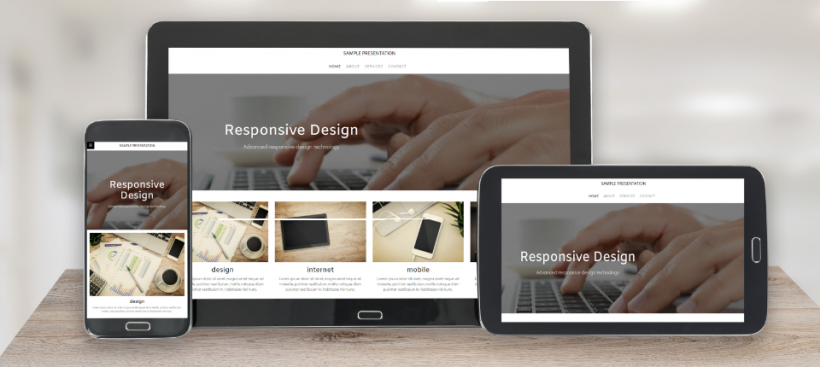
- Mobile-responsive: Over half of web traffic comes from mobile devices, so it’s vital that your site adapts to different screen sizes.
- Fast-loading: Users expect pages to load quickly. A slow website can lead to high bounce rates.
- Easy to navigate: A clear navigation structure with logical menus is key to keeping users engaged.
Step 7: Testing and Launch

Once the design is complete, test the site extensively. Ensure that all links work, forms are functional, and the site looks great on all devices and browsers. It’s also a good idea to have both you and the client review the site to ensure everything meets expectations.
Finally, it’s time to launch the website!
Conclusion
Creating a website is a multi-step process that goes far beyond just putting together some designs. It’s about carefully analyzing your client’s brand, understanding their objectives, gathering and organizing content, and focusing on user experience. By following these steps, you’ll ensure that the website not only looks great but also serves its purpose effectively.
